Using an X-Rite ColorChecker Passport in Lightroom: Page 3 of 3

Setting accurate white balance
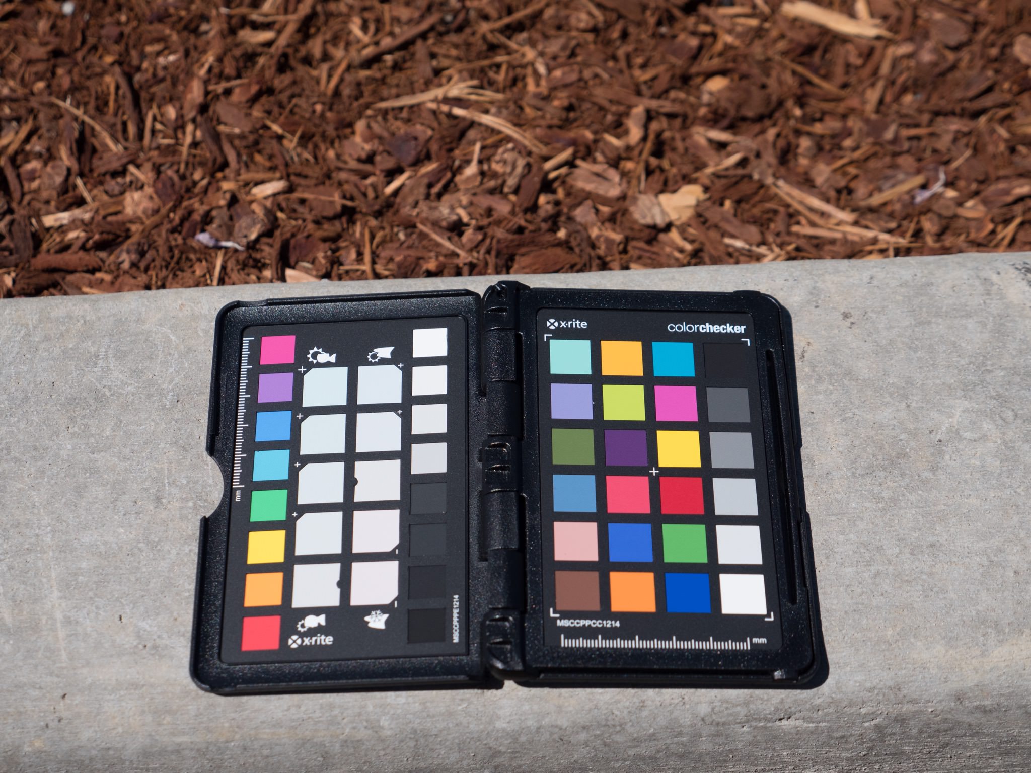
To set the white balance, open the Basic adjustment and click the eyedropper next to WB (White Balance), then click on the neutral white square on the ColorChecker Passport. Looking at the screenshot below, you'll see that there are two rows of white balance tabs. On the left, for the Portrait category (indicated by the icon of a person), pure white is the first (bottom) tab. The other tabs are increasingly cooler shades of white, so if you were to click on these, the resulting white balance would be warmer — something usually flattering for portraits. To the right of that you see the Landscape category, and there the neutral white is in the middle. The flanking pairs are color shifted so when you white balance from them, the image goes more blue or more green — often an advantage when shooting landscapes. The two neutral tabs (first on portrait; middle on landscape) are identical though.
This screenshot was taken before clicking on that color tab. Notice the RGB readouts in the red outline below. Originally, the camera white balanced the Red and Green perfectly (89.6% each), but the blue was a little high at 91.7%. This is obviously quite close to neutral already. Also note on the right that the WB setting shows, “as shot”, Temp at 5,150˚K and the Tint at +21.
 Setting a custom white balance using the ColorChecker Passport is a critical step in ensuring total color accuracy
Once clicked, the White Balance shifts to 5,650 and +17…
 The custom white balance adjustment has shifted both Temperature and Tint slightly
…and the actual white tab is reading at a perfectly balanced 89.9% on all three channels.
 The white balance is now a perfect RGB match
And now, here is the result. On the left is the original RAW image, and on the right is the calibrated and white balanced one. The white balance has notably shifted, but look closely at the blues and yellows — that's the custom profile at work! Having those two colors accurate will be very important, as you'll soon see, as those were prominent colors in this shoot!

Syncing the Profile and White Balance to the rest of the photos
The next step is to get the same profile and white balance on all other matching photos. This is, of course, why I organized as I did in the beginning. All I have to do is click on the “GX8 outdoors” Collection, select all the photos in it (ensuring that my already adjusted Passport photo is the primary selection), and sync to the rest.
 Select all images in the filmstrip, ensuring the already adjusted image is the “primary” selection
If you thought recognizing which is the “primary” selection in Aperture was hard, it's even worse in Lightroom. Notice the first image (of the Passport) above is a slightly lighter shade of grey than the rest of them? That means it's the primary selection, and when you Sync, it'll grab settings from there to propagate everywhere else.
So then, to sync, click the big Sync button, you'll be presented with this dialog:
 Sync the Calibration and the White Balance across all your photos to copy the custom profile and, of course, the white balance
What you want to sync are the Profile (which falls under Calibration) and the White Balance. Select, click Synchronize, and that's it.
Removing Profiles
If you ever want to delete a profile from your system, you have to do that in the Finder. I did see on a forum a reference to a tool to do this, but this works too. Navigate to the Library (option-click on the Go menu to reveal Library) and navigate to ~/Library/Application Support/Adobe/CameraRaw/CameraProfiles.
 Here’s where the profiles are hidden in the Finder
Does it make a big difference?
You be the judge of that. Remember I pointed out that the blue and yellow were prominently changed in the original photo of the ColorChecker Passport? Take a look at this photo; yellow is the color of Dollar General, and blue is on the big Frosted Flakes box. But the biggest change is in the orange tiger costume!


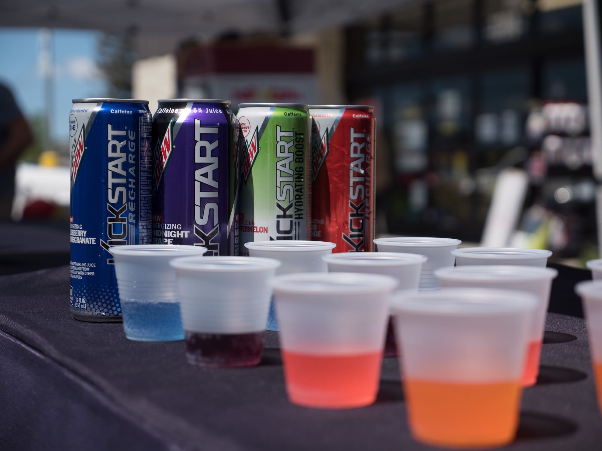
Here's another example, of one of the sponsor's beverages.

This seems like a lot of work, but it really isn't once you get the pattern down. Is it worth it for every shoot? Probably not, but it certainly can't hurt. If you get into the habit of taking a photo of that Passport on every shoot (and you don't have to do it in the beginning… remember I nearly forgot and shot the indoor ones at the end), then you'll at least have it if you need it. And of course, if it's important to your shoot to have color accuracy, then the X-Rite ColorChecker Passport definitely a great way to ensure that you've got it.
Pages
- « first
- ‹ previous
- 1
- 2
- 3
Comments
on March 4, 2017 - 6:51pm
This video is terrific. No more using Adobe Bridge for me! Thanks!