When Aperture Isn’t Enough (aka, “Anatomy of an Interior Design Composite”)
 An elaborate composite of 17 unique photos and over 20 layers
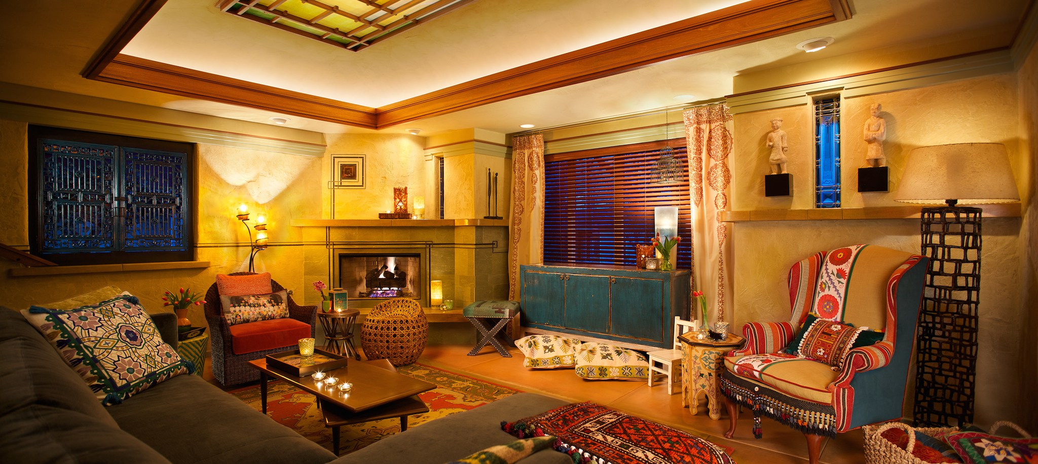
We love Aperture, but naturally it doesn't do everything you might possibly need when editing your photos. I was hired many months ago to create an image of an interior designer's handiwork to print as a showcase piece for their new design studio, and since Aperture doesn't do compositing, needless to say this was a task beyond the scope of Aperture itself.
That doesn't mean however that Aperture wasn't used. On the contrary, Aperture was used quite a bit, starting with tethered shooting and note-taking, then to basic photo editing (making selects) and overall file management, then finally white balance adjustments before being sent to Photoshop.
Tethered shooting
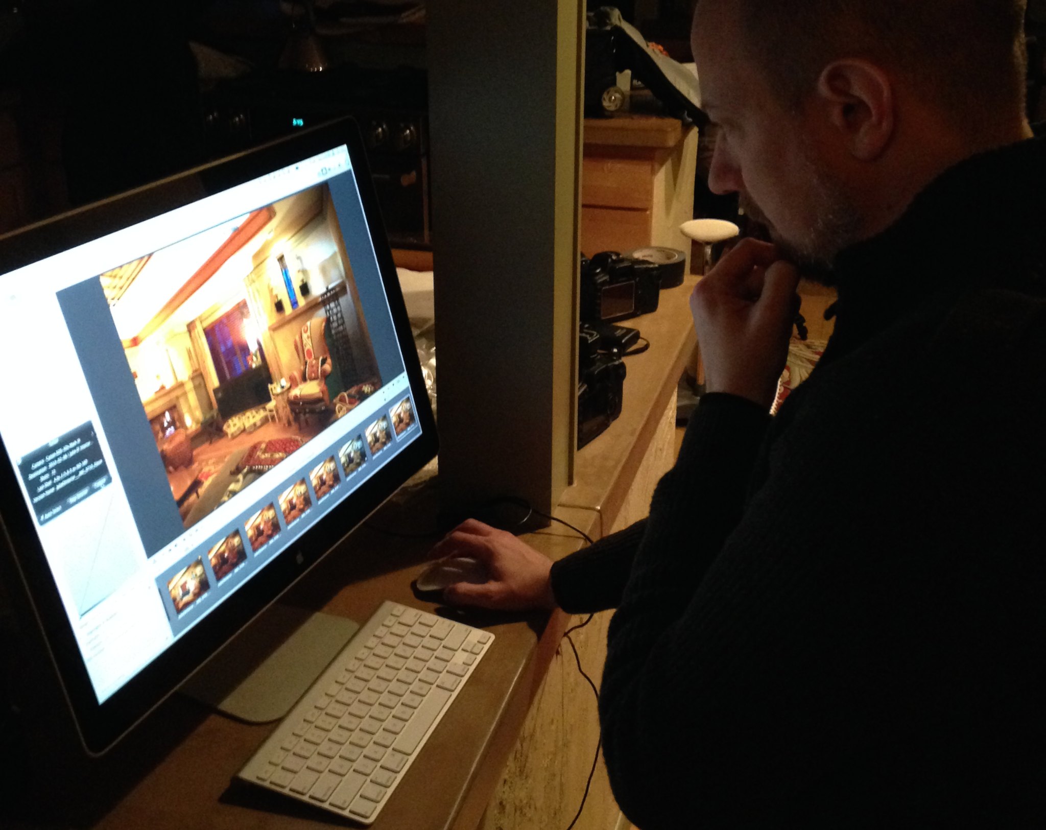
For a scene like this, shooting tethered was critical. I set up my 27ʺ iMac on the kitchen counter so I could examine every lighting detail of every shot before moving on to the next stage, and also so the client could put a critical eye on placement of objects throughout the scene. Every pillow, every drape, every chair, every candle… all meticulously placed!
 Me at the iMac, pondering if this shot works or not
Shooting tethered (no matter what system you use) is really one of those fantastic studio experiences. The difference between looking at the back of your camera, at the embedded JPEG on a small screen vs looking at the actual RAW file on a big computer display can't be compared. If you've never tried it, Aperture supports most cameras for tethering. Give it a go, just to see how cool it is!
Making selects, note taking
Lots and lots (and lots and lots) of photos were created, because after each test shot, something would get adjusted. Usually a light or reflector, but occasionally a pillow or some other effect. We really tried to not touch the scene once we started shooting, but ultimately we did have to move a couple of pieces around.
 Over 300 images were made, the vast majority of which were throw-away
Once everything was settled on, a final shot was made, flagged, and had a caption added to note what it was for. Since many elements were lit and photographed individually, but without moving the camera, keeping track of that was critical.
 These selects are flagged and captioned with their purpose
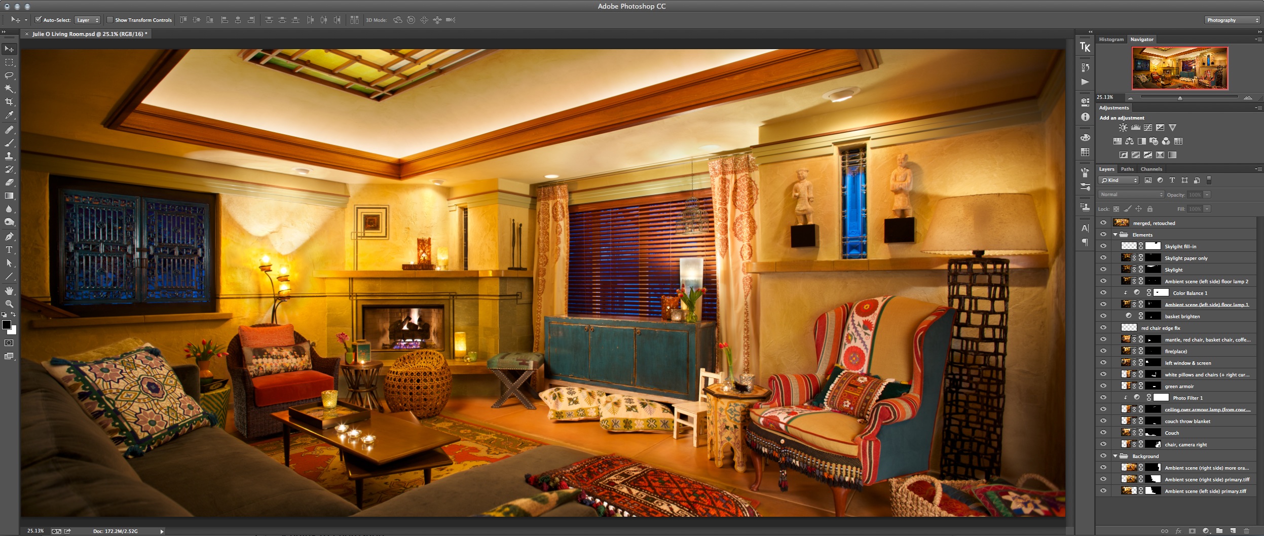
Once this was all complete, I had 17 primary files to use for the composite. Some were duplicated and altered further in Photoshop later, resulting in over 20 layers in the final file.
Sending to Photoshop
Again clearly this work wasn't all going to happen in Aperture. I found it easiest to export a full size TIFF file from Aperture, then link that as a smart object into the Photoshop composite. This kept the final file to a more reasonable (ha!) 1.62 GB size, linked to an additional 2.86 GB of original TIFF files.
One thing I did do in Aperture was adjust white balance on several images. Even though it was fixed in camera, as lighting moved, reflecting colors off the walls, and in some cases simply wanting to make the glow from a light warmer, I found tweaking the WB in Aperture worked out well for that.
Here's what the Photoshop file looks like…
 The final composite, in Photoshop CC
Managing the final files
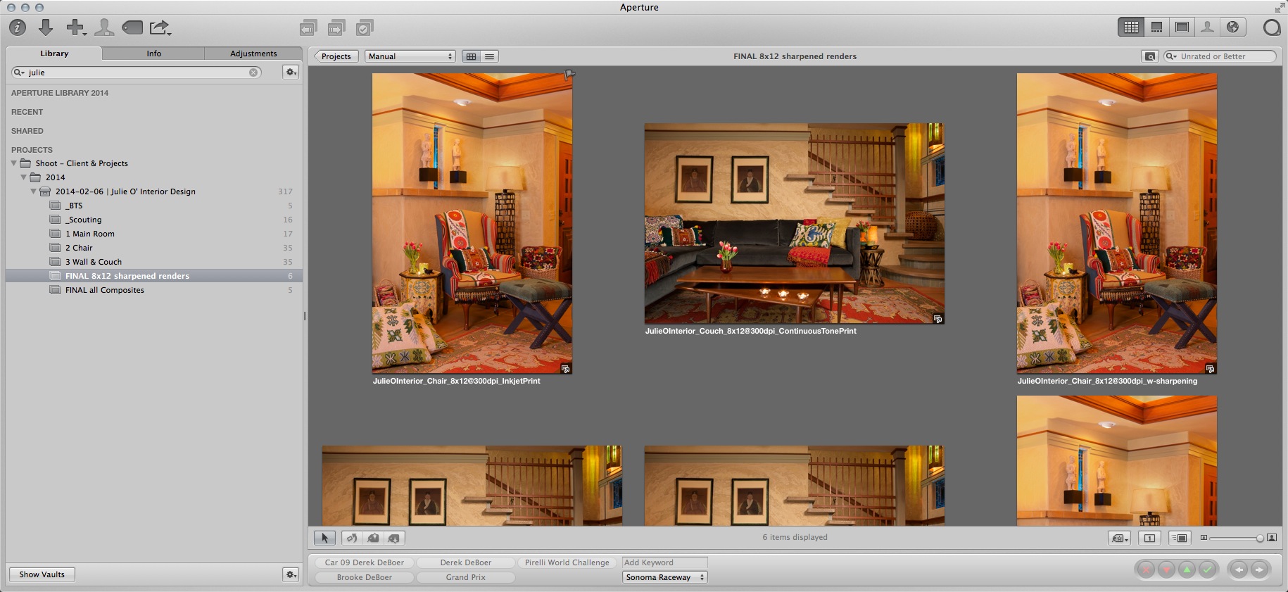
Even though this is a Photoshop project, it's still managed in Aperture. In fact, I even output a variety of print-ready files, sharpened for output at specific sizes, and reimported those to Aperture. I do have to remember when dealing with them (although it's not hard; the caption says “sharpened”) that these file should not be re-output. If I want to send these to a printer again, I'll just File > Show in Finder and send that file off. So yes, to do this, you have to work referenced. This is not the typical Aperture workflow; usually you just select your full size file in Aperture, and export whatever you need at the time, send that then delete the output. But these were meticulously sharpened for specific printer styles, and so I need them to stay as pure as they are.
 All files, including final sharpened output files generated from Photoshop, are still being managed back in Aperture
As you can see we did a few different shots, however the big one shown at the top of this post is the one that had the extensive layering. The others were only a couple of blended exposures.
Show me the process!
If you frequent my photography blog at photojoseph.com/blog you may have already seen this, but just in case, here is a Keynote presentation I recorded with voice over to explain the entire composite process. It's a bit long, but hopefully interesting!
More like this
- Tip
- Tip
- Tip
- Forum
- Tip

Comments
on August 31, 2014 - 11:05am
Actually, there is not even a need to work referenced here. “Export Master” (“Export Original” in the new iPhoto-merger terminology) would work just as well.
on August 31, 2014 - 5:04pm
@PhotoJoseph
— Have you signed up for the mailing list?
on September 1, 2014 - 12:04am
Hi Joseph So with both shooting and post, how many hours did it take. Joe B.
on September 1, 2014 - 2:24am
@PhotoJoseph
— Have you signed up for the mailing list?
on September 8, 2014 - 6:39pm
Joseph, very interesting. Thanks for taking the time to share the beginning to end process. Just curious about the focal length you choose. I assuming not too wide or you would have mentioned dealing with distortion issues. If you had a similar shoot to do again, how much time do you think would be saved having had this one under your belt? What size print did the client ask for and was that known to you prior to the shoot? I know you cannot reveal any pricing, but was this a flat bid or did you charge by the hour? Thanks again. Always enjoy hearing you teach.
on September 23, 2014 - 1:22am
Hi William, sorry I didn't respond sooner…
The lens I used was a tilt-shift 24mm, and as you may have seen in the video, the full width of the room couldn't be captured in a single image. I chose the TS lens so I could slide the lens instead of pivoting the camera, precisely so I wouldn't have to deal with distortion. However I spoke with another photographer after doing this and he said he'd done the same thing with a regular lens and rotating the body, and it stitched just fine (just like doing a panoramic), and that distortion wasn't an issue. Given that the edges of the TS lens aren't very sharp, I'd probably try that next time.
If I did this again, I might spend less time in post, but probably not much. I'm sure if I went back into the file now, I'd find another few hours to spend messing with things ;-) There's always more to do, y'know? I don't imagine the shot itself would go any quicker though, because we had that very well planned, and the duration was all about moving lighting and solving problems specific to the set at the time of the shoot.
I knew the customer wanted “big”, but a size wasn't determined in advance (understandably she wanted to see who it came out before committing to a print). She ended up ordering a 24” wide print though which wasn't nearly as big as I'd have liked, to be honest. The file is 8,200 pixels wide, so could easily do a 40” print at full rez without even scaling. Even a 60” print would still be 136 dpi and look great from a foot away.
Finally, I charged a flat rate, based on what I thought it would take. Licensing included, for a pretty specific use. Given the time it took, the fee should have been higher, but then again, given that it's a single photo for a small shop, there's no way I could have charged more. Her original budget was ⅓ where it ended, but she understood my explanation of what could be done for such a low fee, and decided to go for it — and was very happy she did in the end!
@PhotoJoseph
— Have you signed up for the mailing list?