More Interface Changes in Aperture 3.3

There’s been a lot of chatter about the updated monochromatic interface, or UI, in Aperture 3.3. I’ve seen a few people who like it, but most aren’t impressed. It’s true that removing all colors from the UI leads to a less distracting interface, which is generally good all around, however it may make it harder to find certain items at a glance.
Of course, like Lion’s “natural” scrolling, this may just take some getting used to. Here are a collection of before and after screenshots for your comparison.
The Library Tab & Toolbar
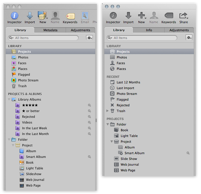 Aperture 3.2 vs Aperture 3.3 Interface
The colors are of course the most obvious difference. There’s also a new Recent collection, and Projects & Albums has been renamed to simply Projects. The automatic collection of “★★★★★” (five star) and “★ or better” are gone, and instead there are collections of Last 12 Months and Last Import. Flagged has been moved to Recent as well. However this loss of five star collections only applies to new Libraries; upgraded ones will still have them.
(The difference in the staggered structure of the Albums, Books etc are just me being careless when making the screenshots… you can place them wherever you like, as before)
Metadata = Info = Metadata
As you can see in the tabs above, the Metadata tab is now called Info. This, along with the new structure under Recent, is iPhoto territory.
Wait… but is that bad?
I know a lot of people are going to get very excited over this “dumbing down” of Aperture, and I will do a dedicated post on the significance of the Unified Library architecture later, but let me just say this now — making it easier for people to upgrade from iPhoto to Aperture is a Good Thing™. Upgrades mean sales, and sales means more future development for Aperture. So we now call Metadata “Info” and Masters “Originals”. We will survive.
Adjustments
Some very significant changes here, for sure.
RAW Fine Tuning and Levels and Color are no longer part of the default set, while Curves has been added to the default set. But there are more important things afoot. We already looked at some of the changes (including the Auto White Balance feature) but notice that now that we have a “magic wand” Auto Enhance button, it’s taking the place of where the gear menu used to be, which has been moved to the bottom.
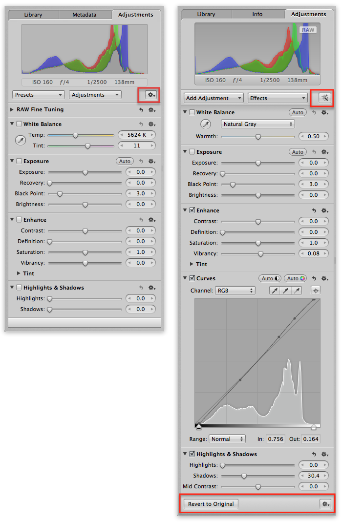 The gear menu has been moved and a new “Revert to Original” button is available.
I can’t say I’m a fan of the gear menu being at the bottom, since everything it controls appears in the histogram at the top of the screen, however I do like the addition of the Revert to Original button. Of course you always had this feature (and still do) under the gear menu, but that button makes it easier for new users to find their way around. And for any of you saying “just learn the app”, as someone who spends an inordinate amount of time pointing out the basics, I’m thrilled to see features that will reduce the getting-started questions.
Library Icon
OK it’s a little thing, but it’s pretty, so here you go.
![]() The new Aperture 3.3 Library icon
The new Aperture 3.3 Library icon
There’s more…
There’s a lot more to talk about, and we will be covering it all… stay tuned.
CORRECTION: The Curves is not part of the default set. It showed up in the screenshot above because when I hit the Auto Correct button, it applied Curves.
To add it to your default set, of course just click on the gear icon, and choose Add to default set.
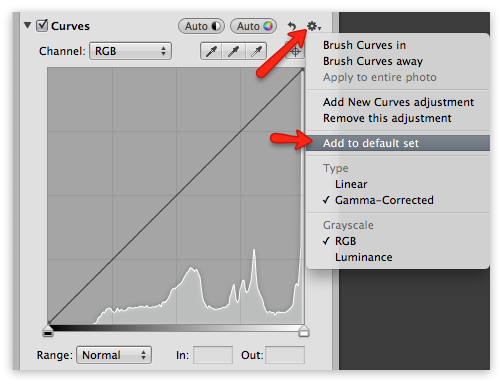 Add an adjustment to the default set, so you always see it
Compared to iPhoto…
Here’s a screenshot comparing the new Library listing in iPhoto to Aperture. Here you can see the logic in the rearrangement, in an attempt to make the migration easier to follow.
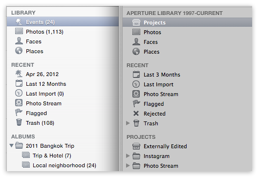 iPhoto 9.3 vs Aperture 3.3 Library project listingAbout the only difference is Events vs Projects. The “Last 3 months” in Aperture is custom changed in the preferences, and the same can be done in iPhoto. I’m honestly not sure what the palm tree thing with the April 26 date on it is in iPhoto… it was empty, and it’s an old Library that I use only for testing, so I really can’t imagine what it’s for!
Comments
on June 12, 2012 - 10:08pm
While some of these changes may not appear to be popular for some users … and some may not quite make sense … I think these changes bode well for the future of Aperture … as in we now see there is an interest to further develop the app … something that was a huge question for quite some time …
on June 12, 2012 - 11:01pm
No sane person can say it´s good the colors are gone !?
Overview is good, less overview is bad.
Only few persons have perfect vision, and by removing the colors on the library/folders/albums etc you miss overview. Each user now is stuck sitting and studying 3-4 mm small dull grey icons. Its bad during training/helping each others too. Think about your student calling you asking why he don’t have this or that functionality. How do you ask him if its a folder, project, smart album or….?
Bad design, bad for the users.
People saying less color leads to less distractions….hey guys…you can hide the inspector or run full screen.
They already destroyed Mail by dull greyish it (even removed pinch to zoom !) and peculiar they goes totally opposite in design of fx ical. Next “improvement” will be a dull grey dock and the same for the launchpad !
From my point of wiev, no real improvements, only messing around with stuff. Fx. where are all the previous fine tuning possibilities in highlight and shadow ? Gone for a mid contrast slider ! Bad ! Instead i got iPhoto effects…..gosh.
Good is that the failure in white balance tint slider seems gone, and most of the problems running full screen also seems to have vanished. But the failure when using presets are still there (if you have a long list of presets, using mbp, the preview of effect goes below the screen bottom edge so you can’t see whats going on).
Still looking forward to a decent history browser, lens correction, better sharpening and better noise reduction…..and speed…..and now also better overview.
on June 12, 2012 - 11:23pm
Been playing around with the updated Aperture. Observations so far:
- On my 2010 MB Pro with 8 gb, it seems a bit zippier. Photos load faster, moving from photo to photo is faster.
- Also, making adjustments seem smoother. Not as much lag when using brushes.
It may be my imagination, but after using the “Professional Enhance” button, photos look more natural. In 3 out of 4 photos, it provides a great starting point for making fine tuning adjustments. But it seems like the over-all photo rendering algorithms and raw processing have been improved. May be my imagination, because i can’t do a before and after comparison.
- The Skin Tone White balance works very well and is a welcome addition.
- I don’t particulary care for the monochrome menu and icons, but I will probably get used to it.
- Nice to be able to access Aperture and iPhoto together. May use iPhoto a lot more.
- Haven’t yet decided if the changes to the highlight/shadow is a plus or minus. Seems we lost some controls, but I wasn’t using them very often anyway.
All for now.
on June 12, 2012 - 11:57pm
Its terrible!!
I don’t use PSE, Lightroom or iPhoto for that matter I use Aperture. The ‘improvements’ are offset by too many losses, color being the most significant.
Why would you attract post processing users from iPhoto to Aperture by making them similar? Make them different. P&S photographers have all they need in iPhoto, when they join ‘the big boys’ they will use big boys processing progs!
You never have enough gear!
on June 12, 2012 - 11:57pm
Not Impressed with the removal of color and icon changes in general. I didn’t like it in the new version of Lion and now it shows up in one of their products that is known for it’s viewer appeal. Apple has always done graphics so well and lately, in the UI department, they seem to be taking two steps back for every one foreword. Apertures elegant UI is now no different than the very bland Photo Mechanic I used for years. I really preferred the 3.2 UI. Not sure why they have to mess with little things that don’t need fixing.
Daniel J. Cox
on June 13, 2012 - 12:14am
My Software Update says I am up to date. Yet I am do not have the latest Aperture. Is the update only good for newer computers/OS?
Dick
on June 13, 2012 - 12:55am
At first the page on Apple’s site said you could use 10.6 now it says 10.7.
I have been hanging on to Snow Leopard because I need Rosetta to run a legacy PPC design app that I depend on for my business. However, with this move by Apple I am finally pushed to switch over to Illustrator CS6. I will probably have to run Snow Leopard Server OS under Parallels in order to be able to access my old and critical drawing files. Too much money and what a hassle!
on June 13, 2012 - 12:56am
Dick … the minimum OS for v3.3 is OS X Lion 10.7.4
on June 13, 2012 - 1:58am
Personally I love the loss of colors. The structure of my library is based on date and so I have never used the colors to help me find all the different places with in the library. It looks a LOT cleaner and is less of a distraction while browsing or editing. The hierarchy of my folder > Projects > Albums has always dictated the layout and made it easy for me.
That being said I can see why the loss of colors has a lot of people on tilt. The obvious change it self is one thing, and the loss of “landmark” type icons to help navigate quicker.
As a tip to help add some color back in, have a look at this tutorial on using special characters. Might help some. (Sorry Joseph, no intent on hijacking the thread, just felt this was an appropriate place to help.)
http://www.youtube.com/watch?v=s1jP1Z0mQKE&list=UUI713jdwdTIxZ7WzCn-oRGg…
on June 13, 2012 - 1:59am
Have to say I really like the interface & the adjustment changes. Whenever I have to use Snow Leopard on an old MacBook, I think the coloured UI looks so dated. The new WB & Highlights/Shadows are much improved, well done Apple! Another upgrade Is coming within the month as Mobile Me is till embedded in this version. Let’s hope we get V 4.0. Should be excellent!
on June 13, 2012 - 2:08am
Having read most of the comments here, I fully agree with Nathan Smith. I have never used the colors to help me find different projects or albums and I like the much cleaner look.
If I need to make changes that Aperture does not do well I simple roundtrip to Photoshop, which is very rare since Aperture handles almost everything I need to do with the aid of Viveza 2 or Silver Efex Pro 2 for black and white.
I have played around some with the upgrade and I believe Apple has done a good job on the changes they have made.
on June 13, 2012 - 2:35am
Nathan, thanks for that video — very cool. If you don’t mind I’ll make a post on that and embed your video. I love it!
-Joseph
@PhotoJoseph
— Have you signed up for the mailing list?
on June 13, 2012 - 2:40am
@Joseph - Go for it. Anything that helps others transition better or just simply makes things easier for users.
on June 13, 2012 - 2:45am
I decided to give the upgrade a try. I am neutral on the lack of color in the toolbar. The change to Highlights and Shadows is a real bummer. I tried to recover a picture where my flash had failed. Worked good in the old H&S but could not do it in the new version. I don’t like moving the gear box to the bottom. I created a keyboard shortcut to reset adjustments so I don’t have to scroll all the way to the bottom if I have a lot of bricks open. I still have an older version of iPhoto so the library merge does not apply. In that I rarely use iPhoto except to download a cartoon or low res picture from the web I doubt I will upgrade to the new version. I don’t see how the new Retina display will help if you use an external monitor like I do. I don’t like editing on my 17”MBP and would like editing on a 15” less.
Milt
on June 13, 2012 - 2:45am
I probably prefer the colours….maybe. But overall it doesn’t bug me. I prefer the monotone in other apps, strangely enough (like finder and iTunes), but it was a bit disconcerting in Aperture since I did use the colours to navigate (and it being a ‘pro’ app, it was already pretty drab missing the traffic lights).
Anyway, just a few impressions after a long night of backing up and rebuilding to make sure I upgraded smoothly….
Aperture 3.3 is FAST. I’ve only opened it once, but it was pretty blazing. Hope that keeps up. For the record, I’m on an non-unibody 15” MBP (core2Duo with 6GB RAM).
I noted that after the upgrade, the actual files within the Aperture Library are still in a “Masters” folder. I do wonder if this is just because it’s an upgraded library, or if new libraries do the same.
Likewise, are new libraries called “Aperture Library”? I figure if they aren’t changed for upgrades, that it’s a measure to stop Time Machine going nuts afterwards. I upgraded my 480 GB library, no new previews or thumbnails were generated, and Time Machine only required ~ 2GB of backups afterwards (although it did take a very long time to figure it out, as it typically does when I make Aperture Library changes).
This is going to be my fave site for a while :) Exciting times!
on June 13, 2012 - 5:08am
Seems the old style Shadows and Highlights brick DOES exist. If you edited a photo with those adjustments at an earlier time then you still have the option to edit those settings. There is an upgrade button at the top of the brick however that lests you change it to the more current version.
http://cl.ly/0G2z1p430h0i1l2b2j2y
*EDIT*
If you have a preset that you saved with the old style highlights and shadows it will also work like the old style.
on June 13, 2012 - 5:09am
I miss the colors. Why keep creating better monitors and retina displays only to take a step backwards in UI - strange. Most people see in color so a colored UI is more intuitive, an Apple stalwart characteristic.
Two other complaints: on the adjustment panel the Add Adjustment and Effects are now switched left to right; and the Albums with 1star to 5star and my other custom Smart Albums are now below the Projects at the bottom of the Library panel. If anyone figures out how to move these please share. Also, I tried the new Auto Enhance on 5 easy to difficult photos and the results are blah at best compared to manually edits. Maybe it’s better than iPhoto enhance.
on June 13, 2012 - 5:52am
I found a work around for putting a Smart Album higher up the Library panel: create a folder and move folder to wherever you want it, then drag the Projects, Albums and Smart Albums to the new folder. I called my folder “My Favorites” and then arranged the items by most used at the top.
on June 13, 2012 - 6:07am
Joseph: regarding the “disappearance” of 5-star ratings(etc) in NEW LIBRARIES:
I just tested this and after importing a few test images and RATING THEM 5 STARS–THEY SHOWED UP IN MY 5-STAR SMART ALBUM. In other words it seems to work with new projects. I put them in a new test project and ranked them 5 stars and they show up in the library 5 star smart album. Thanks
“There’s also a new Recent collection, and Projects & Albums has been renamed to simply Projects. The automatic collection of “★★★★★” (five star) and “★ or better” are gone, and instead there are collections of Last 12 Months and Last Import. Flagged has been moved to Recent as well. However this loss of five star collections only applies to new Libraries; upgraded ones will still have them.
on June 13, 2012 - 6:22am
Joseph: I may have mis-read your post on disappearance of 5 star ratings in the recent Aperture update. You were specific–it is gone in new libraries. My test was run on an old–but updated library. So I just tested it in a NEW LIBRARY. I imported a few images–ranked them 5 star and made a smart album for 5 stars. They do show up in the new library’s 5 star smart album. Not built in, but I believe the function is still there.
But I am not able to MOVE the albums (equivalent of the previous aperture”s library albums up–physically up on the side bar of the library inspector. Anyone able to do that? They seem locked at the bottom of everything else. Thanks..
\
on June 13, 2012 - 6:54am
Vidpixarts,
Right, my point was that there is no new default 5-star album. Yes you can still create them.
I’m seeing more similarities between this and the iPhoto layout now that I’m comparing them too, including the ALBUMS collection that shows up on upgraded Libraries, but not new ones.
I haven’t tried moving them around yet.
-Joseph
@PhotoJoseph
— Have you signed up for the mailing list?
on June 13, 2012 - 8:28am
Nathan, your video is very cool and I love the idea of adding colored symbols to Aperture, especially since I love the color IU and will hate losing it. I had no idea we could get the Emoji on the desktop either. I use them all the time on my iDevices. However, when I go into the symbols under Emoji, I only have a red dot, not green or purple. I wonder why? I’m up to date with Lion. Has yours changed since you made the video?
TIA!
~Debbie
on June 13, 2012 - 1:40pm
As a “newer” user of Aperture, I would agree it makes common sense to start off with the “Professional Enhance” button. If it saves time and effort, why not?
However, having said that, I’m confused as to where the Raw fine tuning adjustment button went. I see that it says “RAW Fine Tuning and Levels and Color are no longer part of the default set”. To me, it says that its not part of the default set any longer, but it can still be accessed somewhere. Where can I find it if I do want to do RAW adjustments even after trying the “Professional Enhance”?
Steve Hadeen
on June 13, 2012 - 1:48pm
Steve,
Select RAW Fine Tuning from the Add Adjustment popup menu at the top of the adjustments pane (under the histogram). Once it appears, open the gear menu next to it and select Add to default set to get it to show all the time as before.
Thomas
on June 13, 2012 - 4:57pm
Thanks Thomas.
Steve Hadeen
on June 13, 2012 - 9:17pm
I found the removal of the colour annoying, but didn’t fret as it’s easy to get the colour icons back, either by replacing the new ones with backed up ones or editing them in PS.
Just right click the aperture app, tell it to show package contents, navigate to resources and all the images are in there SL- is the prefix for the non full screen icons, also the x2 are the Retina icons.
simples….
Would have been better if it was a preference choice.
life is never simple
on June 14, 2012 - 11:41am
One item from the Apple note on using a unified library:
Only the pick image of an Aperture stack is visible in iPhoto. For example, if you have created several stacked versions of a photo in Aperture to try out different adjustments, only the image you have selected as the pick image of the stack will be visible when you open the library in iPhoto. When you return to Aperture, the entire stack will again be accessible.
This is a bummer, since I use Stacks in Aperture kind of like Events in iPhoto to group related photos (yes, I realize that Apple is calling Projects in Aperture the equivalent of Events in iPhoto, but I have 400 Events in iPhoto and I don’t need those cluttering up my Aperture sidebar. Hence the stack approach).
Forewarned is forearmed!
on June 14, 2012 - 1:27pm
Thanks for that Brett; I hadn’t thought of stacks and yes that is a logical approach.
I’m afraid your use of Stacks is not what it was designed for, so there’s no workaround in place for you. Stacks are meant for a single pick of similar photos (the wedding kiss, the football catch), or for multiple versions of the same photo. It’s not meant for grouping a whole collection of photos shot at one “event”.
@PhotoJoseph
— Have you signed up for the mailing list?
on June 16, 2012 - 9:27pm
One of the things that I would like to see changed is the little Zoom box. It is not moveable or removable.
Seeing as how iPhoto has been doing it as a moving item for some time, it can’t be that hard.
It is most frustrating when used for comparing on small screens like the MBP or MBA as it often hides just the bit I want to look at and then I have to Shift/drag to get the detail.
DJ
DJ
on June 20, 2012 - 10:30pm
Change Inferface as monochromatic to color aperture 3.3
http://zulk.com.br/2012/06/20/mudar-a-interface-monocromatica-para-color…
on June 21, 2012 - 2:08am
Gee, if only Zulk’s tutorial was in English it might be helpful. I couldn’t follow along at all. Bummer.
~Debbie
on June 1, 2013 - 7:41pm
I am a professional photographer suddenly working with an unprofessional interface.
Let me explain: I do have very large libraries and have all my good images rated 5 stars and to find them all back easily and in all my different libraries I just by select 5 star in the Inspector. Now that feature is gone and I have to walk through every single project and select ratings to find them.
This takes too much time!
Does anybody have a good suggestion or alternative, thanks
Lars
on June 2, 2013 - 12:12am
Lars,
Select the photos view to see all photos and filter by five stars, or create your own 5-star smart album to see the entire library at once.
-Joseph
@PhotoJoseph
— Have you signed up for the mailing list?
on June 5, 2013 - 2:00am
Thanks for the tip Joseph, I appreciate that. That would do the trick!
Lars
on February 17, 2014 - 3:25am
I want to say that this article is amazing, great written and come with approximately all vital infos. I’d like to peer more posts like this. So nice to discover someone with genuine thoughts on this issue.
Here, just visit us to buy twitter re tweets
Thank you so much